From four filter bars to one
Every meeting opened with how much people used filtering. Then I watched the session recordings.
- 4 → 1filtering patterns, now one system across 6 modules
- 3at-risk clients I spotted in the recordings
- ~10users tested the flow before engineering started
Why it mattered
Filtering was the most-used feature in the product, and we were proud of that number. In the recordings, power users at 3 clients clicked the same filters over and over, then left mid-search, a few times a day. They weren't going to complain. They'd just slowly stop using the product, and that could have cost us more than one client.
The solution
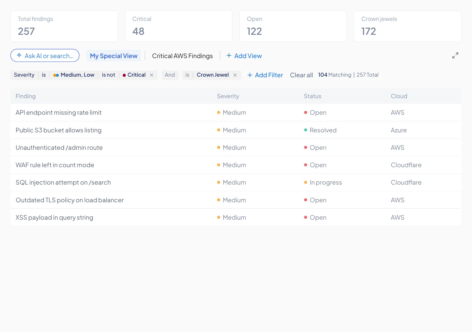
Filtering is basic stuff, and nobody should have to learn a new way to do it. So I went with the classic model people already know from other tools, and made it work the same way, with the same words, in every module.
Same task, four different filter bars, each with its own words.
Findings
Log analysis
Achievements
Inventory
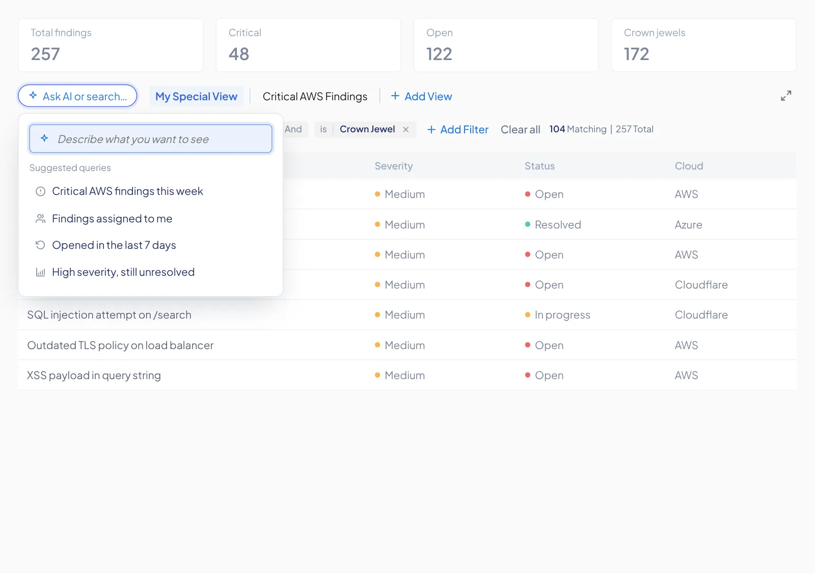
Ask AI
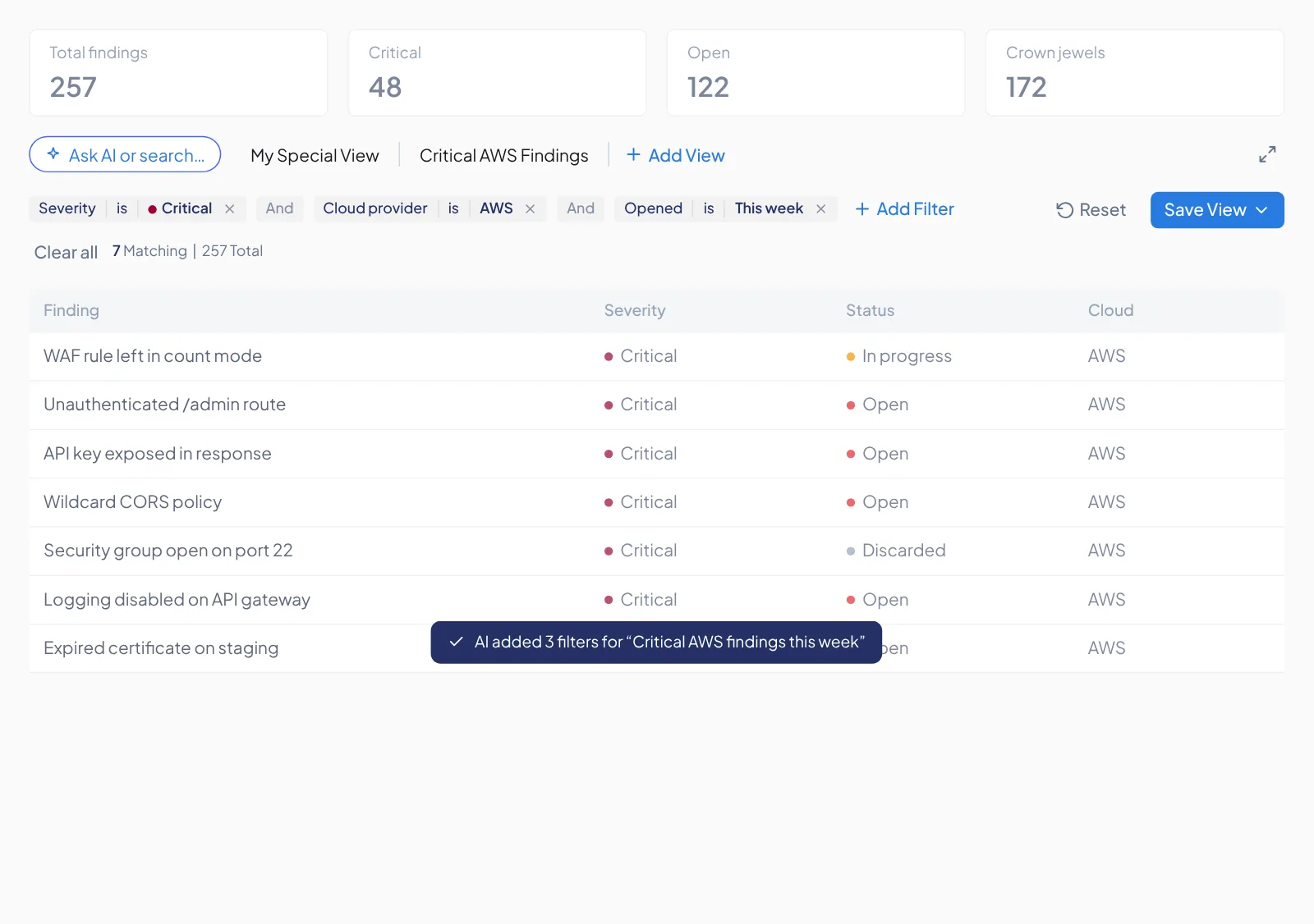
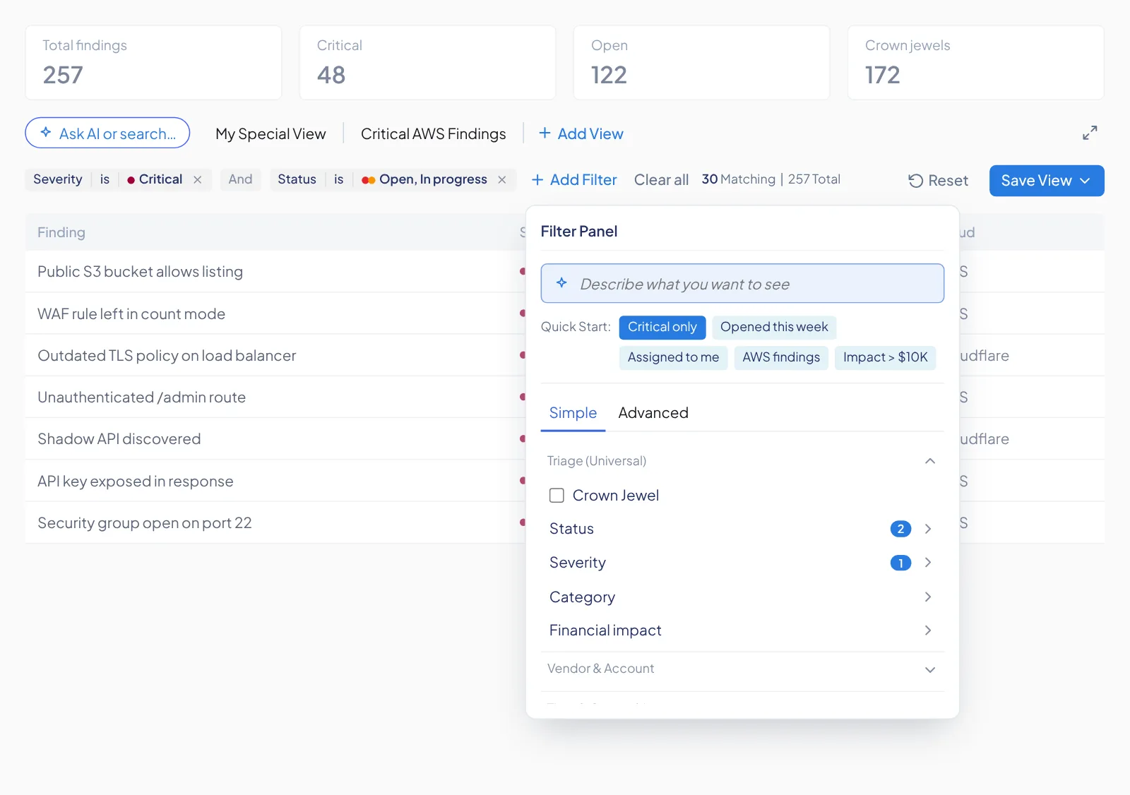
Product asked for an AI helper. I decided where it lives and how it behaves, right in the filter bar, so asking in plain words changes the table itself.
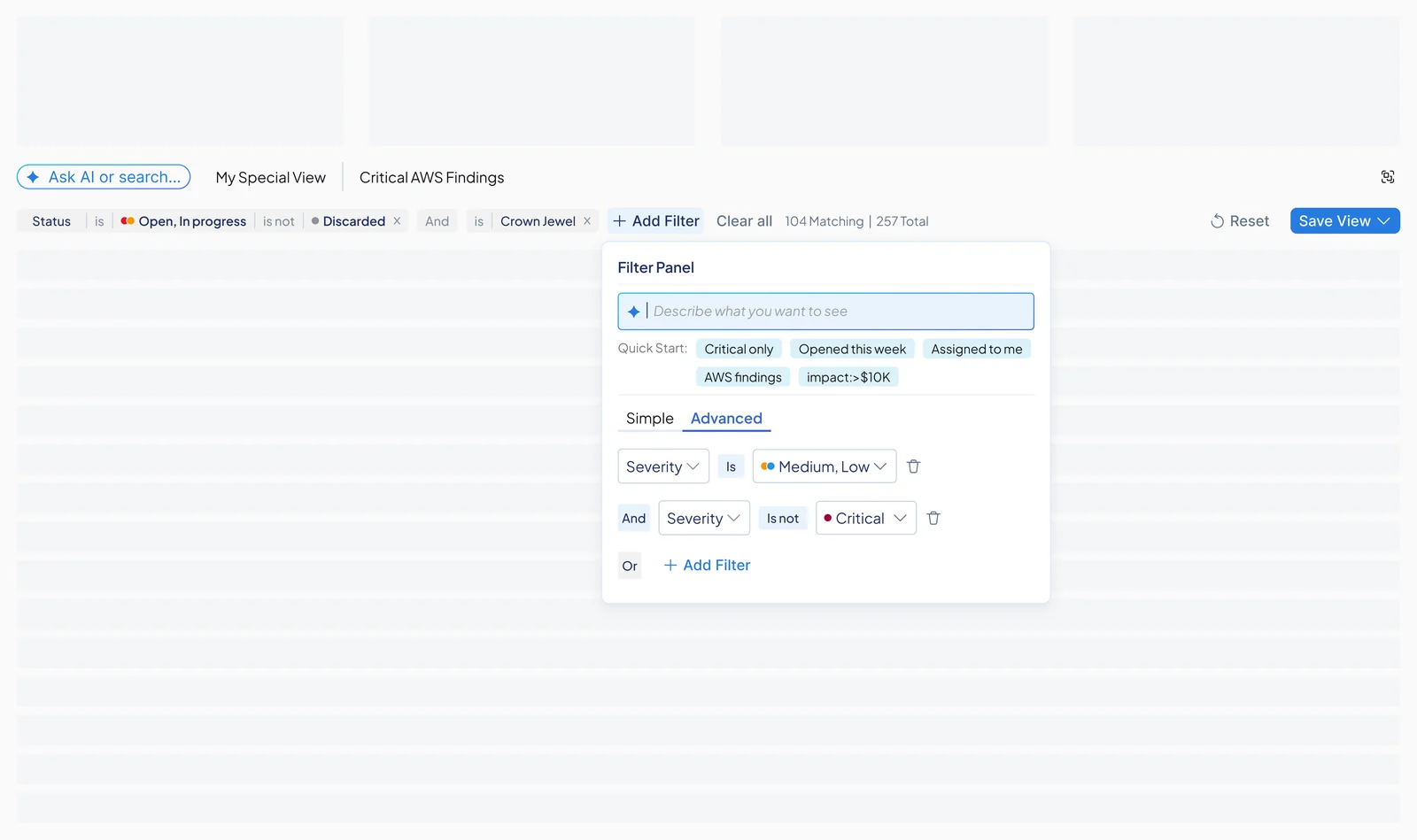
Simple / Advanced
The basics up front. The classic field, operator and value builder is one click away for power users.
Grouped filters
28 flat fields sorted into families, and each customer only sees the ones that apply to them.
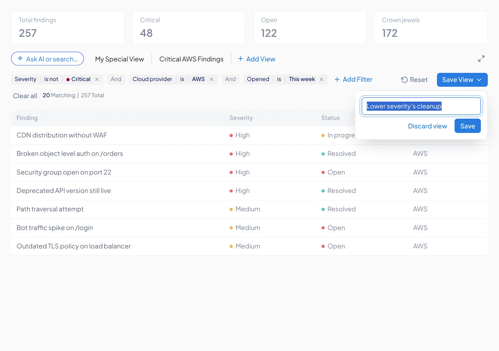
Save View
Build a filter set once and come back to it tomorrow, so daily investigations don't start from zero.
What we learned
I used to read high usage as good news. This project changed that for me. Our most-used feature was where people struggled the most, and they blamed themselves instead of telling us. These days I watch a few recordings before I trust a dashboard.
The problem
While designing a new Findings page, I noticed the filters acting weird and asked the dev team to take a look. Meanwhile I went into Amplitude to see how our power users were really doing with the tool they use most.
What the dashboard said
Most-used feature in the product
Every meeting opened with this number, and everyone read it as success.
What the recordings showed
Power users fighting it
The same filter clicked again and again, no result, then the page left mid-search, several times a day.
A typical recorded session (reconstructed pattern)
- Opens Findings
- Clicks a filter
- Again
- Again
- Option is hidden
- Clears all, starts over
- Leaves mid-search
What Customer Success heard from all 3 clients
- They wanted to use the product, every day.
- Filtering didn’t behave like the classic filters they already know.
- The bugs were worse than we had seen internally.
- They assumed it was their fault for not “getting” it.
Under all of that was a structure problem. The product grew one module at a time, and every module got its own way to filter.
- OverviewCategory pills
- InsightsAdd-filter dropdownCategory pills
- Log analysisPill row
- InventoryAdd-filter dropdownChips
- ProfilingAdd-filter dropdown
- AutomationsAdd-filter dropdown
- ZoneVendor A
- RegionVendor B
- LocationVendor C
- Ruleset kindVendor A
- Rule typeVendor B
The evidence
From there I kept coming back to one question. What do people already expect a filter to do? Most of the answers were out there, in tools they use every day. My job was to pick the ones that felt most natural.
Question the assumption
“Most-used” was being read as “works well”. A QA pass on Findings surfaced bugs, so I flagged them to dev.
Watch the sessions
Analyzed Amplitude session recordings with Amplitude’s AI agent: repeated clicks, hidden options, exits mid-search.
Ask the customers
Customer Success reached out to the 3 affected clients. They confirmed it, and blamed themselves.
Audit every filter
Mapped all 6 modules: 4 patterns, 28 flat fields, 3 names for one concept.
Benchmark and prototype
Borrowed from tools users already know, then compared two logic-first prototypes (Claude, Dia) in A/B sessions.
Fast-track, test, ship
Validated with ~10 users in one cycle, then shipped with session recordings to measure the lift.
Collapse into a modal
NotionField → operator → value, with is / is not in every condition, and groups when you need them.
Collapse into a modal
LinearThe filter reads like a sentence, and saved views stay separate from filter chips.
Collapse into a modal
monday.comAI drafts real filter rows from plain words. This is where my AI placement idea started.
Filter field, end to end
KibanaProof that power users need include / exclude and grouped logic.
Also on my reference board
- DatadogRemovable chips in one search bar, plus facets with live counts
- JiraA dropdown per field, with an Advanced switch
- CycodeA dropdown per field, values with counts
- Rapid7Filter chips that show name and value
- TenableSide panel, operator per field, then Apply
- Microsoft FoundryFilter panel that slides in from the right
- SentinelOneAI builds the query, and you can still edit every part
11 products from my FigJam research board, sorted by filtering pattern. Tap any snapshot to enlarge.
28 fields, one flat list
8 families, grouped by meaning
10 to 14 shown, only for vendors the customer connected
The result
Early client feedback was really good, and the new filtering helped close new deals. It’s rolling out to everyone now, and we’re watching the same session recordings to see the difference. It was also our first real step toward making all six modules feel like one product.
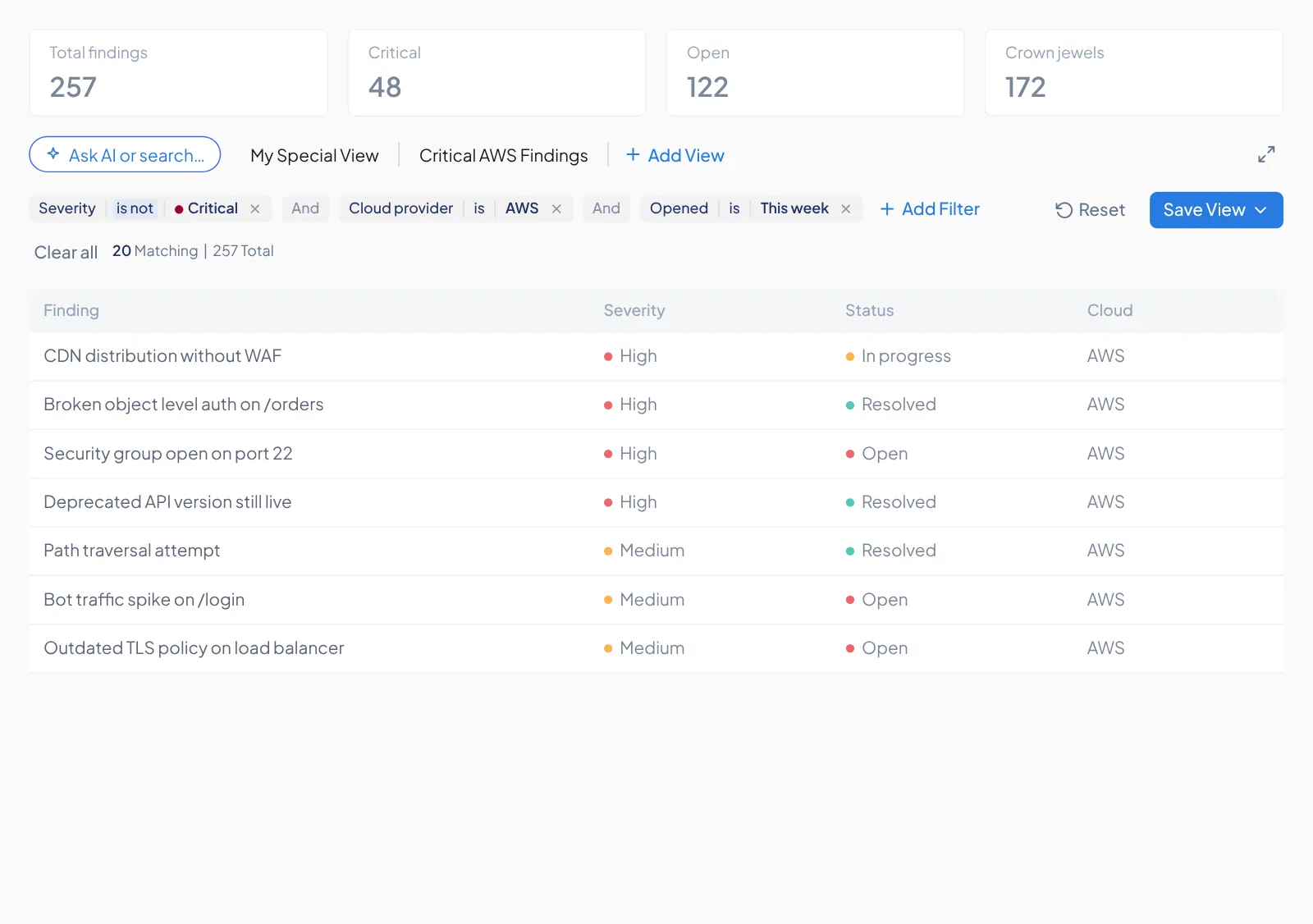
Here’s the flow we wanted people to have, captured from the prototype at the top of this page.
The new flow · tap a step to see it
All visuals use generic, non-company data for confidentiality.